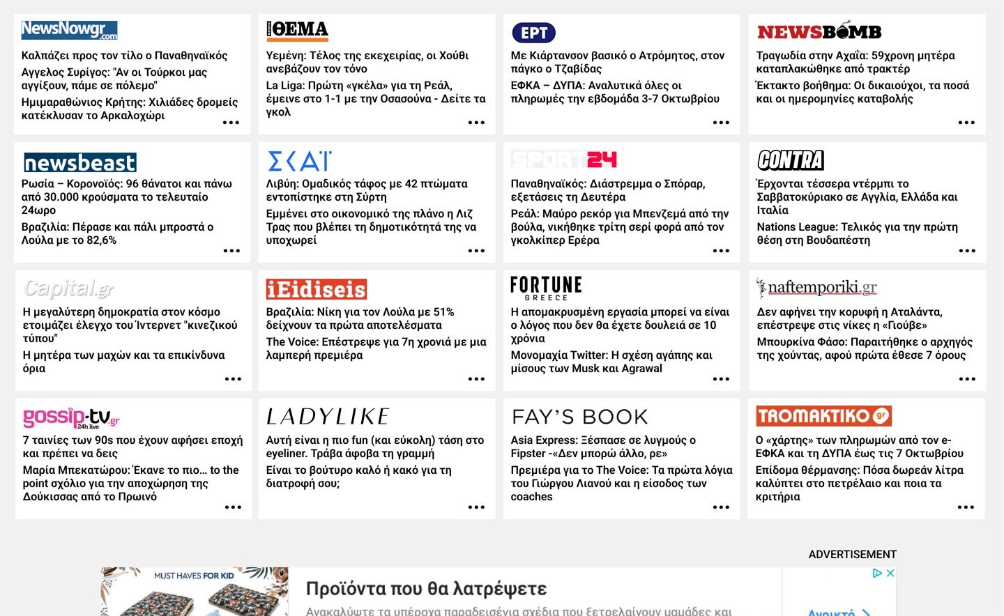
iNews.gr is a news site page, which collects the news from every greek news site, using RSS feeds

Project Details
iNews.gr is a news site page, which collects the news from every greek news site, using RSS feeds.
I identified an important problem: UI and UX was simply missing. The user pain points were so many that it made me wonder how would if I redesign it. So I engaged to a project that didn’t move further, just a case study for my own display work.
I had to design a simple interface, discarding useless information, creating categories etc, and also deal with the many many ads places.

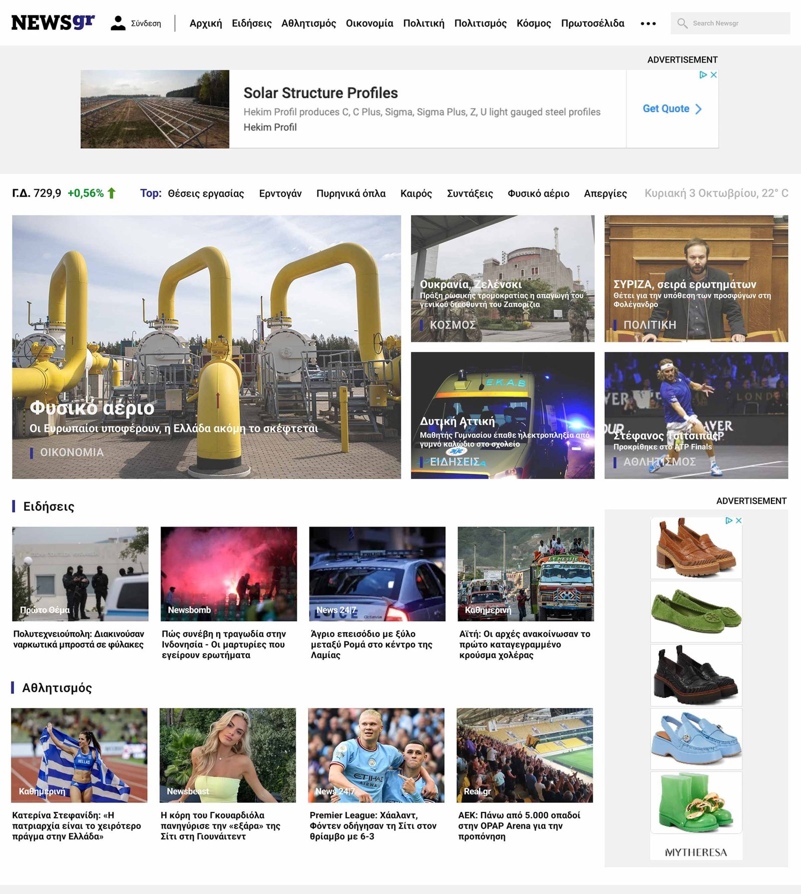
Download full homepage project image ⇲
Let’s talk about your project
2026 © Miepsilon